Dear paper menu,
Cradling you was an escape from a world dominated by screens. You brought people together, if only for a moment, to press shoulders and point fingers at delectable specials.
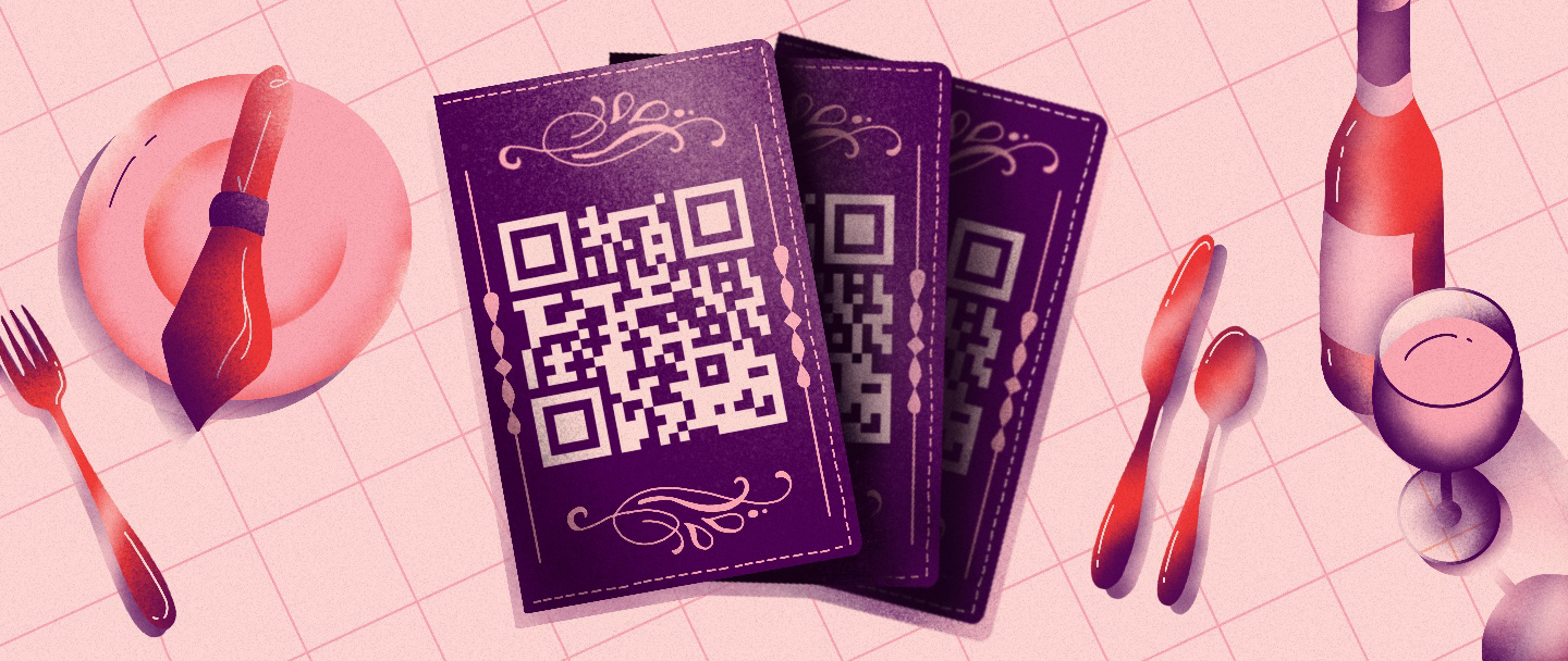
But then everything changed. The strange barcodes popped up on tables across the world—as if we needed another reason to whip out our phones and start pinching our fingers. We missed your concrete presence.
But the digital menus have grown on us. We see echoes of you and of innovations, too. Maybe you’ll make a resurgence. But in the meantime, we’ve collected some five-star examples of your replacements.
Love,
SJR’s designers
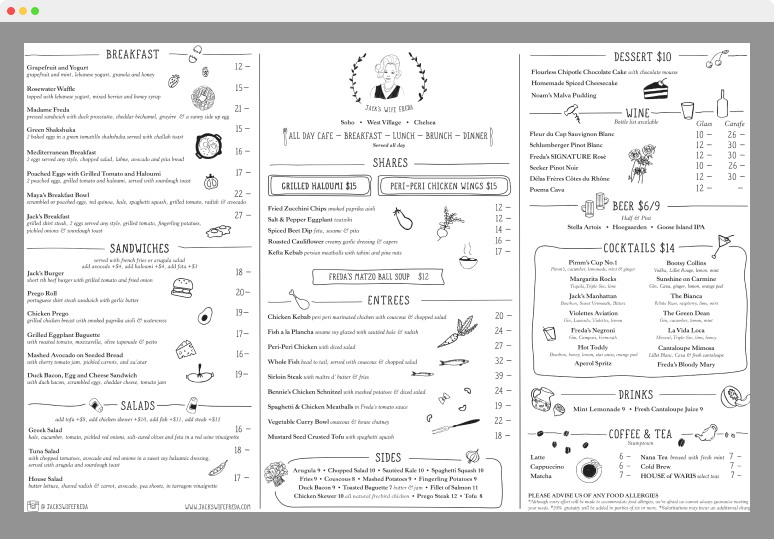
The menu for this NYC staple features playful hand-drawn illustrations that capture the “mom ‘n’ pop” feel of the restaurant. Its Serif font paired with a custom handwriting known as “Jack’s Right Hand” is the perfect garnish for a restaurant built on “stories, recipes, regulars and friendship.”
We’ll order the … tired teapot.
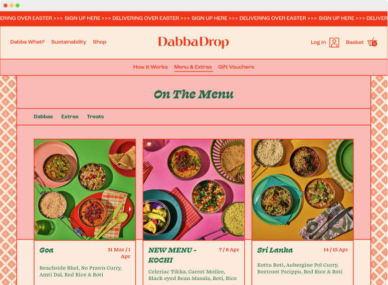
This UK-based restaurant draws inspiration from the traditional Dabbawalas of 20th-century Bombay. The menu is an epic journey—complete with vibrant food photography above each item and a retro 1970’s aesthetic.
We’ll order the … diamond-patterned background.
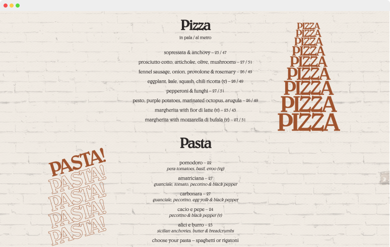
The Mediterranean brick and typography, inspired by Italian cinema, bring authenticity to Di Beppe’s menu. The Canada-based restaurant uses sprinkles of simple animations over a well-balanced color palette to “convey a sense of time and place.”
We’ll order the … animated typography.
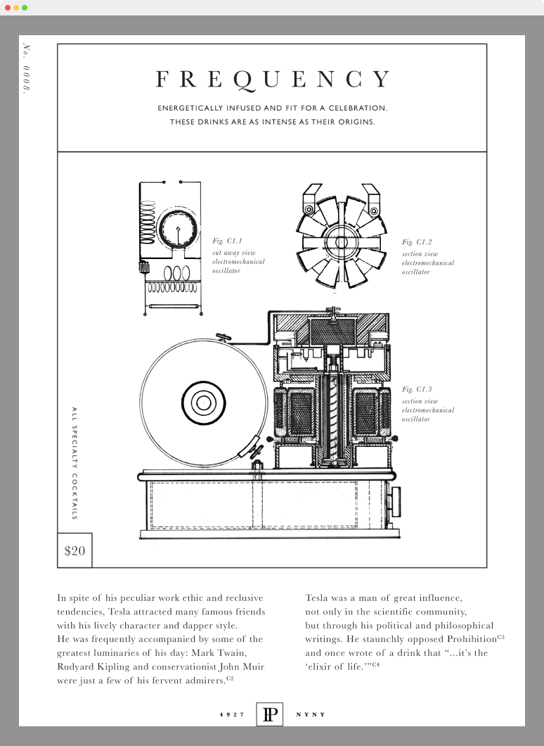
Nestled in the same building as Nikola Tesla’s former abode, Patent Pending transports patrons into the mind of a mad scientist. The NYC speakeasy breaks up its menu into energy-themed chapters and features hand-drawn blueprints for every drink. Intricate details about each ingredient shine light on an experience that is nothing short of electric.
We’ll order the … rough sketches.
